I’ve been researching Japanese nib widths in order to determine which nib size to get eventually from Sailor. Actually I’m trying to get the idea how Sailors nibs on Promenade and Pro Gear Slim might compare to Pilot CH91 and CH912, as well as Platinum 3776 SoftFine (which are the pens I own and use a lot).
Judging by the samples in several threads over at FountainPenNetwork, I feel that Sailor nibs are closer to Pilot than Platinum in width (Platinum seems to be a bit finer in both F and M), but comments seem to suggest that in feel and feedback they are closer to Platinum than Pilot 🙂
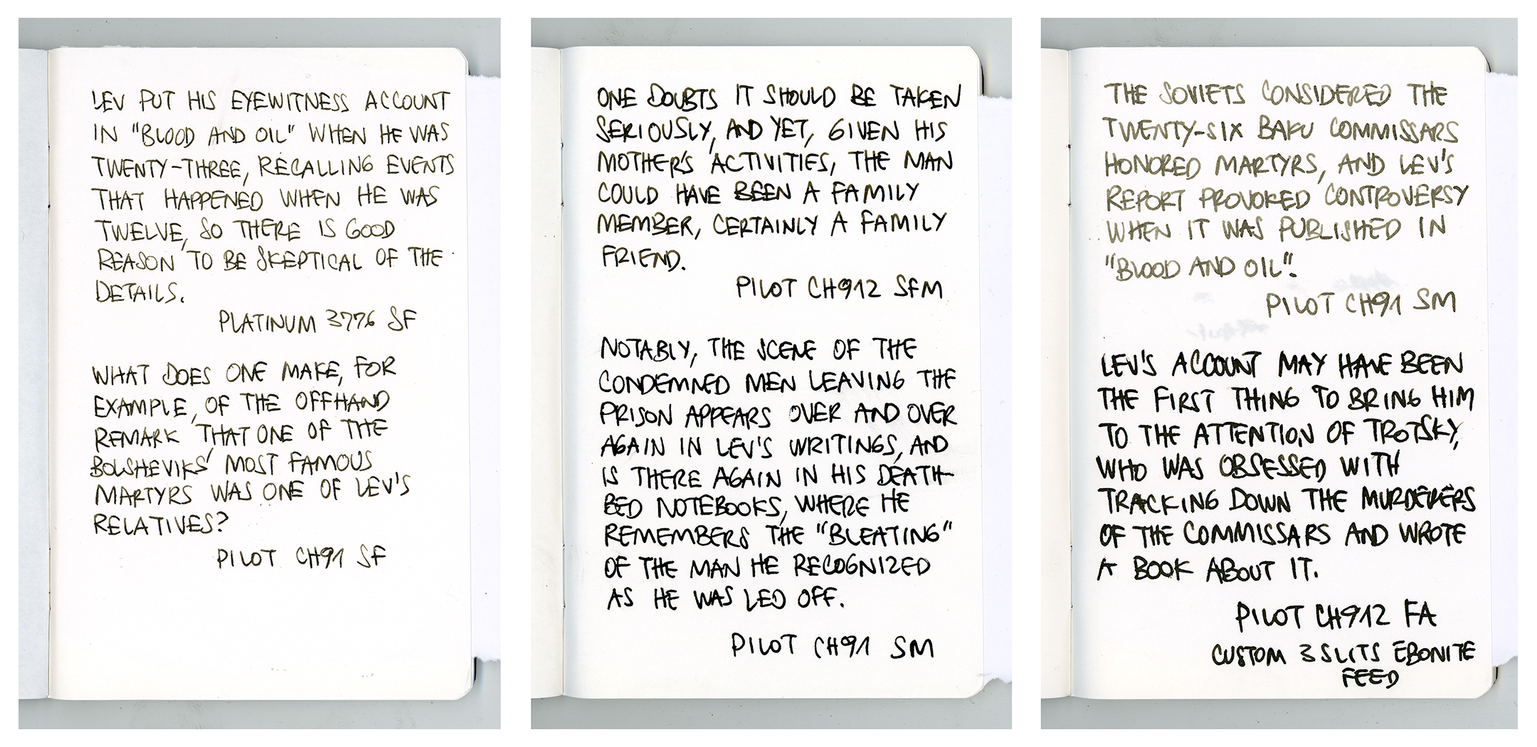
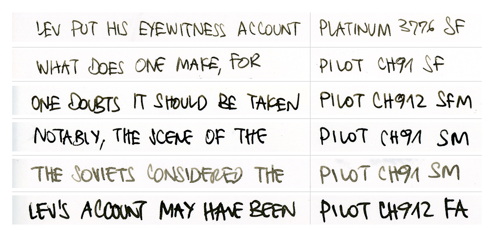
So it inspired me to make a comparative writing samples of several Japanese nibs I own, the gold ones in this case, all Pilot except Platinum 3776.

Platinum SoftFine nib is very fine without pressure, even might be considered EF; I personally don’t need a finer point than this. It can give some line variation, not a ton, as it is not a true flex nib and there is no need to force it to do what it was not conceived to be. But it is beautifully SPRINGY in use, especially for SKETCHING – no wonder it’s one of my go-to sketch pens.
Pilot Soft Fine nib is slightly less fine than Platinum’s (or one might say that it is a true F while Platinum borders on EF). It is also somewhat smoother than Platinum and GLIDES across paper with less feedback (and less audible writing trail) than Platinum.
Pilot SoftFineMedium is bigger jump in size than I expected and is much closer to SoftMedium than being right in the middle of F and M. If I had known it, I probably wouldn’t have gotten one, as I feel that SoftMedium (or combination of SF and SM) is better option than having SFM. On the other hand, that nib is CH912 body which is my favorite, as opposed to SF and SM which are in CH91. So I kept it 🙂
Pilot SoftMedium nib is nice, visibly wider than SF. To me this SM nib is more interesting than SFM as it is somewhat more expressive; with a light touch it can give a finer line than SFM, and then spread a bit more than it. Once again, none of these nibs are really flexible and should not be pushed to extremes.
All the writing samples, except for the first sample of Pilot SM, were written in the same Fabriano notebook and with Rohrer&Klingner Dokumentus Brown ink. The first sample of Pilot SM was written with Platinum Carbon Black ink, which for several years was my waterproof sketching ink of choice. I replaced it with R&K Dokumentus Brown, as it is not completely black but rather a dark sepia which goes nice with watercolors. It is also less “gummy” and flows better than PCB. I also feel that it is less harsh on the pen, not as sticky, but there is nothing scientific in this claim, just a feeling obtained while using, refilling and cleaning the pens.
Anyway, as it was already nearly empty, I washed the Pilot SM and filled it with R&K Dokumentus Brown also. But as I started writing almost immediately after refilling, the ink was still a bit diluted, so lighter than it usually is, and spread a bit more on paper giving a wider line.
The last sample is from Pilot FA, also filled with R&K Dokumentus Brown, but with a custom ebonite 3 slits feed installed (in order to improve and regulate the flow; see that adventure HERE). Even though it is advertised as F nib that is flexible, I always felt it to be M and not really suitable for delicate work. Especially now, as it is fairly wet because of that custom ebonite feed, I find it appropriate and useful for bigger formats.

I mostly use my pens for drawing, but I thought that writing samples could be more useful for comparison. If I had to pick just one of these pens for writing, it would be Pilot SF, as it is smooth in action, but still has some feedback, the flow is just right and it’s line width is crisp for the size of letters I tend to write.
Platinum SF is a bit too fine and too sharp for fast writing, but shines while sketching. Pilot SFM and SM give practically the same result while writing, but are a bit too wide for my lettering; for writing I tend to pick SFM because I like the body of CH912 better, and for drawing, as I said, I find SM slightly more expressive.
Pilot FA (with custom ebonite feed) for me is too wet and too wide to write with, and even for drawing it demands a bigger format and broader and looser strokes.
The samples were taken from The Orientalist by Tom Reiss. In the end, this didn’t solve the dilemma should I get Sailor F or M nib, but it was fun 🙂