
Once again I’m starting a new project and the paper I wanted to use is no longer available here.
Last year I engaged in PAPER TRIPLETEST in order to choose one from the three. With PAPER AFTERTEST the next day I settled for the OLDMILL 250GR and used it for the fifth album of CARTHAGO. I was focused on finding a paper that supports my style of drawing and inking – at the time, I was looking for a solution for BW pages only. With plans to work on comics directly in color I found OLDMILL 250GR lacking for that type of work. Although I managed to complete some samples, it felt more like fighting with paper than working with it:
As I tend to work in many glazes and molest the paper a lot, it has to be a kind that can endure the torture without turning to rag too soon (which sadly is not the case with OLDMILL). In the middle of last year’s testing I performed also the PAPER COLORTEST and now wanted to use SCHOELLERSHAMMER AQUARELLE No10 as the new platform. But, once again, the one I want cannot be bought here and the quest for the replacement was set in motion, leading me to CARTISSIMA where the whole range of HAHNEMUHLE papers can be found.
If they had only the blocks, I would have been forced to choose just one or two, but as they stock all the sorts in sheets also, I was lucky to buy a sample from each paper that intrigued me. I picked them from both categories, student and professional grade, as well a special one made from bamboo fibres. And two samples from LANA (which was bought by Hahnemuhle, or so I was told in the shop).
So the candidates were, from Hahnemuhle Akademie/student category:
275GR TORCHON, 300GR BRITANNIA, 325GR VENETO
From the mould-made professional category:
300GR MATT, 300GR CEZANNE, 300GR TURNER
along with LANAQUARELLE 300GR Grain Fine and LANAQUARELLE 300GR Torchon
And one paper from a special category: 265GR BAMBOO
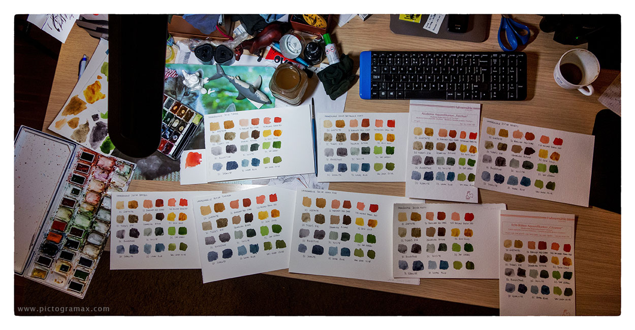
Last evening I started the PAPER CIRCUS, testing them all side by side. Treating them at the same time with same pigments revealed their specific properties – it was intriguing to observe how they differ in character. I would say that BAMBOO and TURNER sit on the completely opposite sides – while the paint stayed wet on BAMBOO even when the papers I treated later already dried, TURNER is really thirsty and immediately drank the paint from the brush laid on it. Not only the time, but also the way of drying is completely different; the paint tends to settle on BAMBOO in blotches while on TURNER it granulates evenly.
Here are the swatches, the same pigments on each sample; sometimes it’s quite obvious how radically different the paint settles, sometimes the result are almost identical (as it is the case with two LANAQUARELLE papers, even though the surface textures are different). It would be too long to describe them all in detail, so I will try to be brief and general:
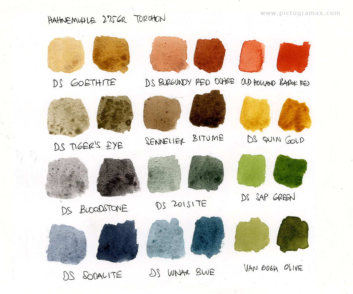
275GR TORCHON has a nice surface for drawing, but due to it’s surface the paint in larger areas tends to settle in puddles
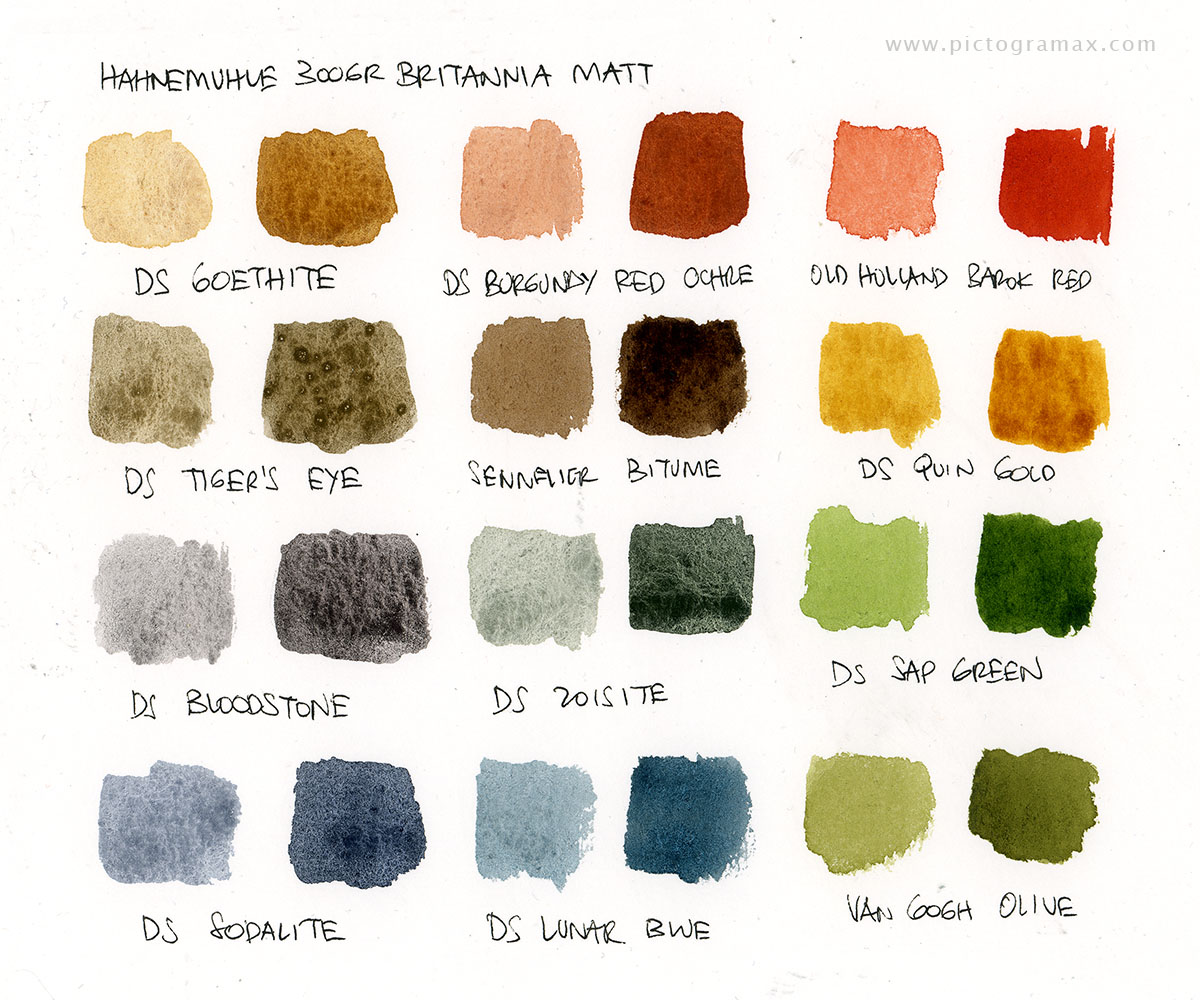
300GR BRITANNIA MATT is great student grade paper, punching above it’s weight; the surface is great for drawing with just the slight tooth to it, with paint it behaves well
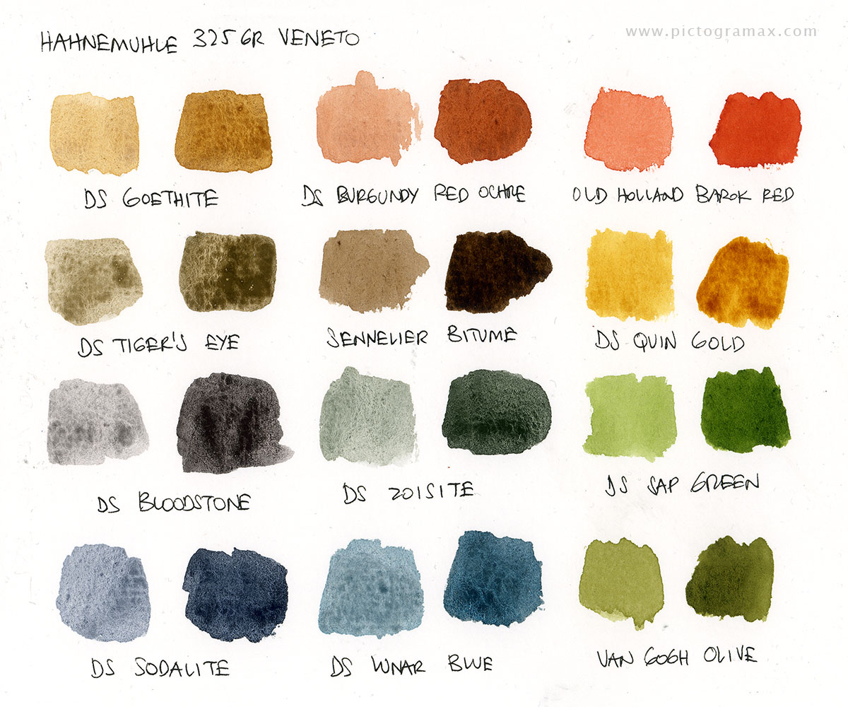
325GR VENETO behaves similarly to BRITANNIA, but it’s texture is not as sweet for drawing
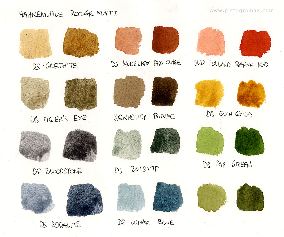
300GR MATT is a good standard watercolor paper; again the texture is not as pleasant for drawing
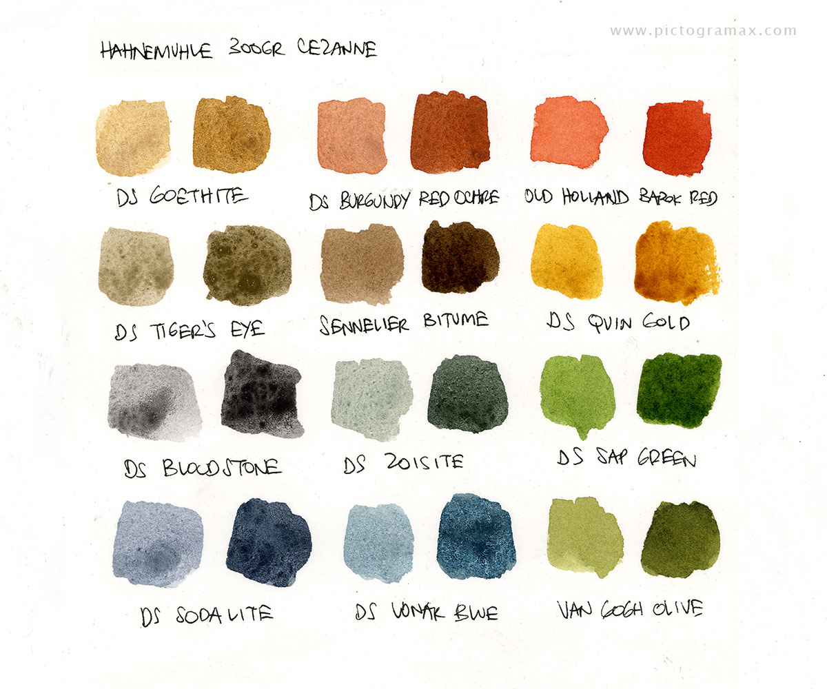
300GR CEZANNE seems just great, both for drawing and painting
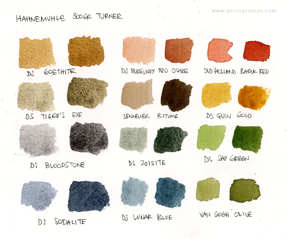
300GR TURNER is very thirsty and more inclined for loose painting than precise drawing
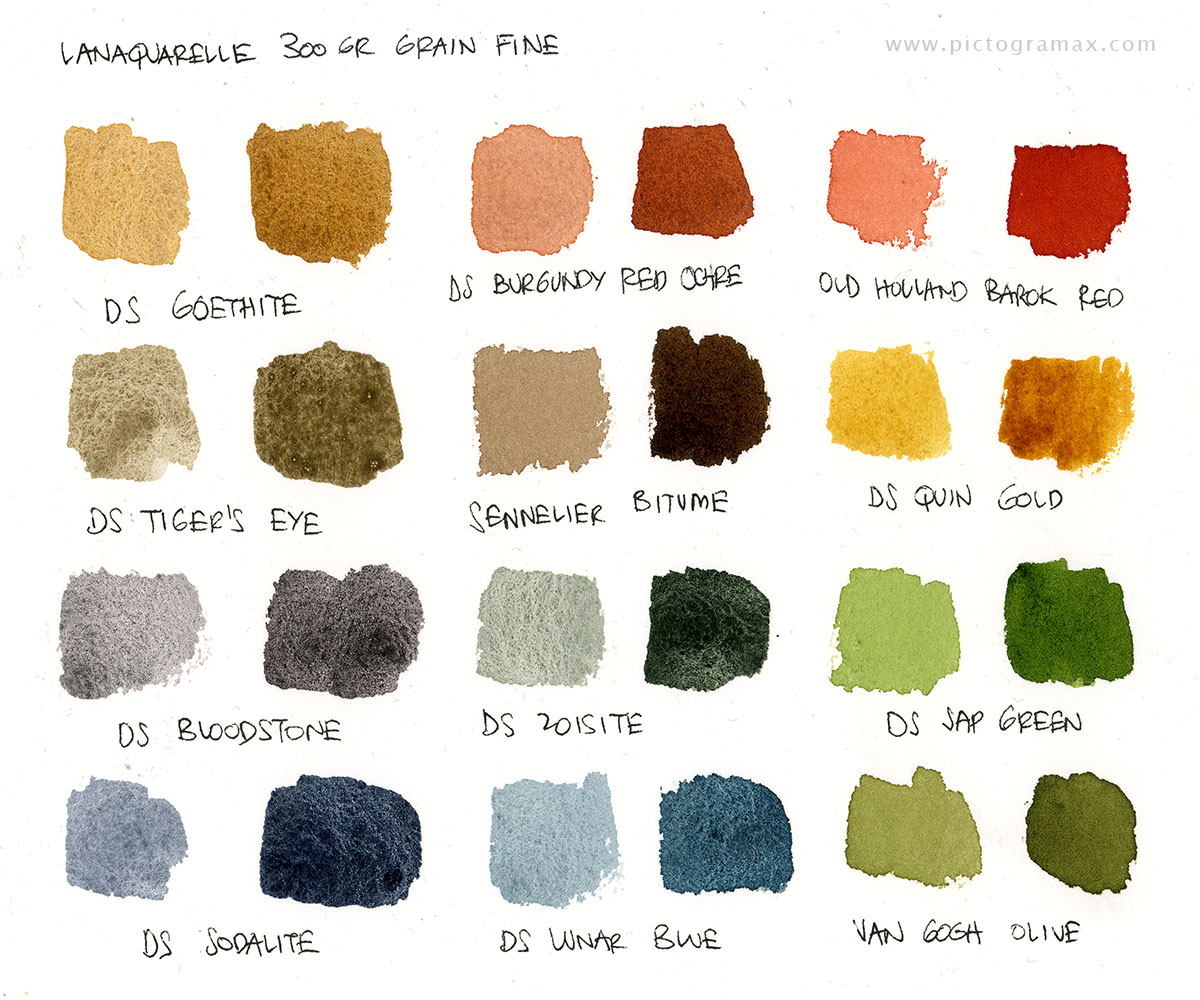
LANAQUARELLE 300GR Grain Fine is great, the texture is toothy but not too sandy and the paint settles evenly with beautiful grain
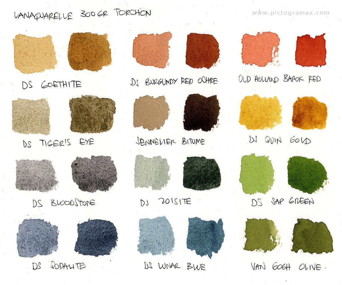
LANAQUARELLE 300GR Torchon gives almost the identical results as the other version as the surface texture is not much rougher
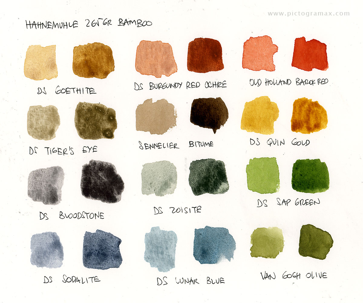
265GR BAMBOO is one-of-a-kind beast here, being an artist paper made from 90% bamboo fibre and 10% rag; the surface is good for drawing but the paper behaves differently from standard watercolor paper – the paint sits on top of the surface, takes much longer to dry and on larger areas settles unevenly in large puddles. To be fair, it is advertised as a mixed-media paper (but promoted as good for watercolor also)
So, after this swatch-testing, the conclusion was that destiny played a trick on me. Again.
The one paper I would choose from this bunch is 300GR CEZANNE, but it is the only one they don’t have in the shop (I performed testing on a small manufacturer sample sheet they were kind enough to give me). I will have to wait for the next shipment in order to thoroughly test it and eventually use it. From the rest, I would go with BRITANNIA as it’s surface is great for drawing and for painting it seems to behave well (by the feel it resembles OLDMILL very much, but behaves better with watercolor) or LANAQUARELLE 300GR Grain Fine. The last one is gorgeous, but it’s surface, being more toothy, is somewhat more difficult for penciling and inking. For painting it’s great. BAMBOO, being so different, intrigued me to test it more.
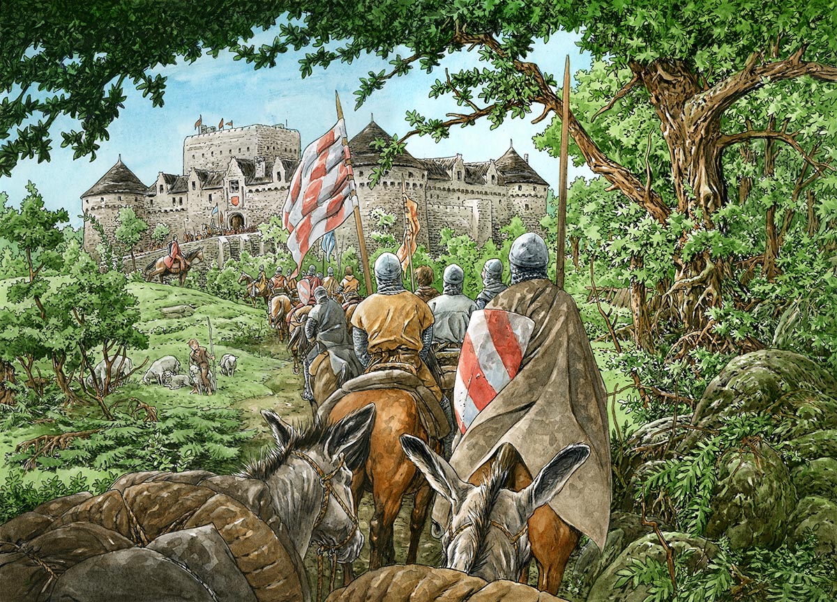
Bear in mind that the goal of these tests is to find a paper that will suit me both for lineart and color work. Before you try to remind me that the HOT PRESSED watercolor paper was invented just for that purpose, let me say I tried several kinds but didn’t like none of them – to me they are neither pleasant to draw on nor appealing for painting. I’m looking for a paper that will be sufficiently smooth for the fountain pens I draw with, but still have the texture and properties that will enhance the granulation of pigments I love to use.
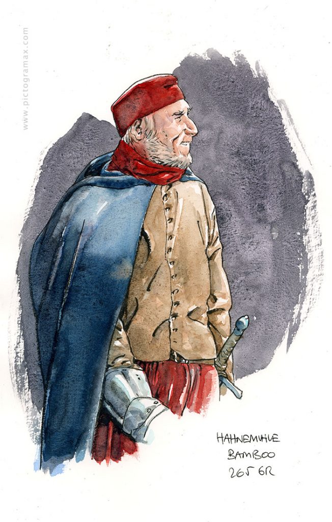

Using BAMBOO in a real-world simulation confirmed suspicions from the previous round. While it is nice to draw and ink on, with paint it behaves strangely, or at least not as I’m used to. Smaller areas with light glazes seem to do fine (the face, the sleeve and the sword handle), but the larger areas of wetter paint take long time to dry and settle unevenly (as on the cloak and background wash). Maybe with some work and adaptation of approach I could find a formula for it, but for now I ruled it out. As a side note, I found ONE OF THE RARE OPINIONS on this paper and the conclusion is different than mine.
As already said, 300GR BRITANNIA MATT is the most similar to OLDMILL in texture and feel and is a joy to draw on. Luckily, it behaves better in painting department and after the second round became a serious contender.
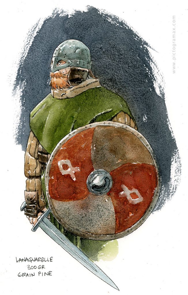
As is the case with the last one for today, LANAQUARELLE 300GR Grain Fine. What this paper lacks in comparison with BRITANNIA for drawing and inking (the surface being a bit more toothy and spongy) it makes up while painting, behaving greatly, allowing for fluid work with pigments that settle evenly and with pronounced powdery texture. I will also try the TORCHON version, but it looks as if they behave in a very similar fashion.
That’s it for today! But stay tuned as the PAPER CIRCUS will continue 🙂
NOTE : And it did, in PAPER CIRCUS DUO