
Went today to replenish my stock of paper before starting new album of CARTHAGO and, of course, the one I used for the previous chapter is no longer available. Murphy rules. So instead of the whole bunch of paper, I came back with three different samples to decide from.
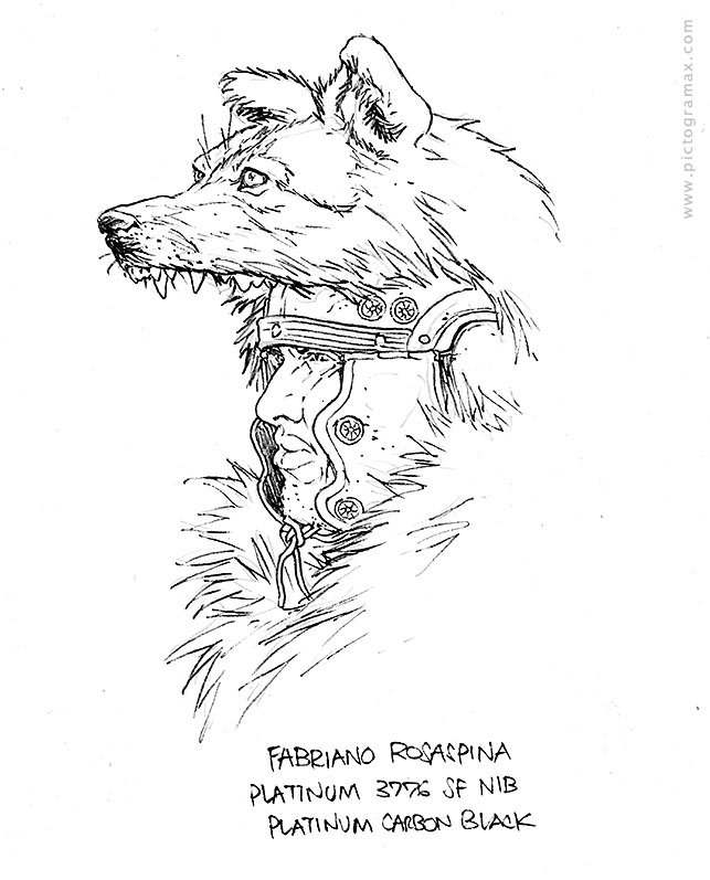
The first, FABRIANO ROSASPINA, looked fine by texture and weight, but with the very first lines it was obvious it will not be chosen. Too spongy and rag-feeling under the tip of the nib of fountain pen, causing it to catch the fibres too often. Curiously, though, no feathering of CARBON BLACK. Might be good for color work, but for continuous drawing would be tiresome. Later I learned that ROSASPINA is Fabriano’s paper for printing – etching, gravure, linocuts and similar.
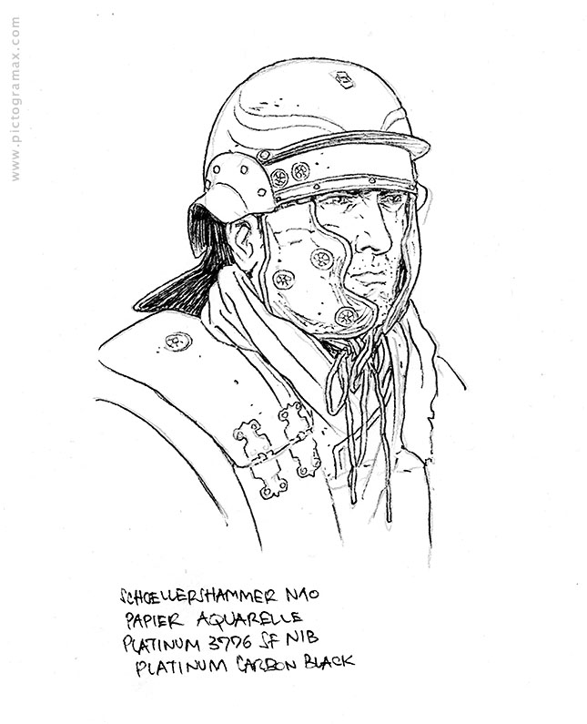
The next, SCHOELLERSHAMMER AQUARELLE, is creamier in tone and with a more pronounced texture. Feels better for both penciling and inking and I’m suspecting it would be very nice for watercoloring. The surface is a bit too textured for linework; not impossible but requiring another level of attention for the finer details (which my pages are full of ).
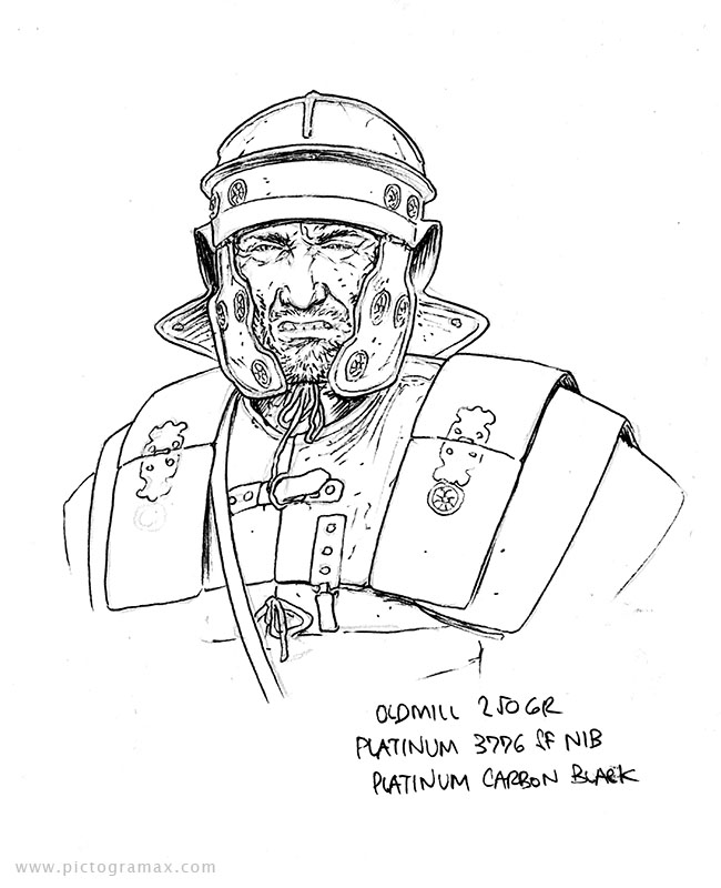
So the last, OLDMILL 250gr, was closest to what I was searching for. The surface has some tooth to it, but not too intensive to hamper detailing and there’s no bleeding or feathering neither. The only downside is that it’s “only” 250 gr, when I was looking for 300, but the other factors, including the price, are in its favor.
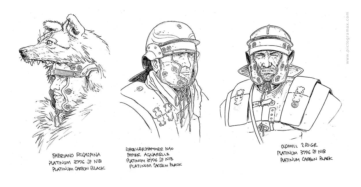
Looking at all three side by side, there is no visible difference between them (and I would even argue that the first looks best as I was the most patient with that drawing). But by the feel while working they vary significantly. So FABRIANO ROSASPINA goes to retirement, OLDMILL 250GR gets chosen for work and SCHOELLERSHAMMER AQUARELLE left me curious enough to try it for some illustration work.