
On my way to ART MEET #20 I made a little detour to see what I might find of watercolor material in a near-by art shop. They carry only the SCHMINCKE HORADAM line. I’ve read that the brand is well regarded, but seemingly for the vibrant and “buttery” quality of paint, not as much for the granulating properties. But nevertheless, I bought two pans to see for myself:
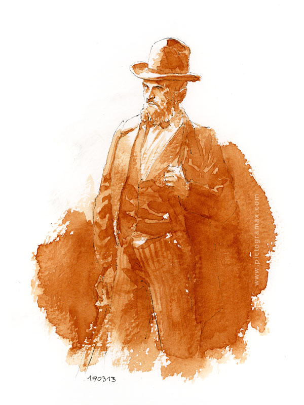
Schmincke GOLD BROWN is indeed a vibrant paint that wets easily and spreads smoothly; the hue has a fiery glow to it, a nicely warm orange brown. It reminds me of one of my favorite fountain pen inks, DIAMINE SEPIA, which shades in close warm tones and could have given the similar result. But Schmincke GOLD BROWN is much easier to work with; it can be moved on paper much more freely and lifting allows for a degree of correction that fountain pen ink simply does not.
But texture? No. The effects in the lower left are the consequence of dragging the dry brush, not the granulating properties of the paint itself. I would love to see some texture in darker parts, giving structure and interest, similar to HEMATITE BURNT SCARLET tested earlier.
The closest granulating hue I found on Daniel Smith’s SAMPLE CHART is POMPEII RED. Although not as warm and saturated (at least from a little paint dot used as a sample), it does produce the speckling effect I’m after:
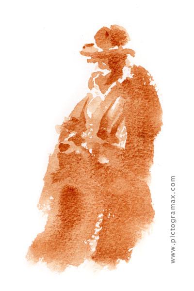
Testing was done on small block of BOCKINGFORD 300gr NOT watercolor paper, that I bought also out of curiosity. I like it a lot, and this is the entry line from ST. CUTHBERTS MILL. Wonder how their top SAUNDERS WATERFORD paper might be.